
Let's build a React chart together! In this article, we're going to build a line chart using SVGs and React. There are thousands of React chart packages available via NPM, but I decided to build one from scratch.
You can watch the video below that walks through the process. You can also reference the notes and resources throughout this article.
Why build an SVG line chart from scratch?
- The effort to create this simple chart from scratch would be the about the same amount of effort as customizing a library chart
- You don't have to add another dependency to the project
- Gain a better understanding of how line charts function
My suspicion that I could create a React chart fairly easily myself was confirmed in seeing that my finished chart component is fewer than 200 lines of code.
Visual aids to stay organized
As I developed this component, I created a series of diagrams to record the various values and expressions needed to render the chart component. A handful of figures - chart width, chart height, and desired padding - are the basis for laying out axes, guides, points, and labels.
Having a visual aid helped me to keep them organized and ensure the formulas to lay out chart components are accurate. I used Lucid Chart but you can use any charting software or even a paper and pencil.
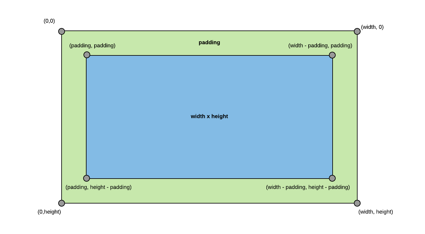
Setting up the container padding and the X and Y chart axes
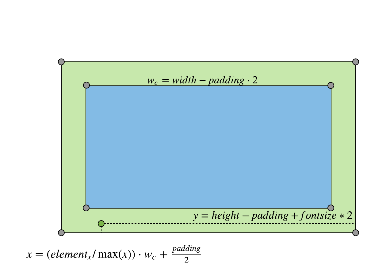
Let's start with the container and chart axes. The first diagram consists of a box representing the chart in a container with padding. I labeled the corners of both boxes with expressions of how to calculate the XY coordinates. The expression variables use the container's height, width, and padding as variables. The height and width are passed in as props to the component.
The padding is calculated by adding the font size of the SVG component and the number of digits for the maximum X value from the data and multiplying the product by two.
padding = (font size + max(x) number of digits) * 2
With these expressions, I can draw the chart's axes
const Axis = (points) => (
  <polyline
    fill="none"
    stroke="#ccc"
    strokeWidth=".5"
    points={points}
  />
)

// Axis start point: (padding, height - padding)
// Axis end point: (width - padding, height - padding)
const XAxis = () => (
  <Axis
    points={`${padding},${height - padding} ${width - padding},${height -
      padding}`}
  />
);

// Axis start point: (padding, padding)
// Axis end point: (padding, height - padding)
const YAxis = () => (
  <Axis
    points={`${padding},${padding} ${padding},${height - padding}`}
  />
);
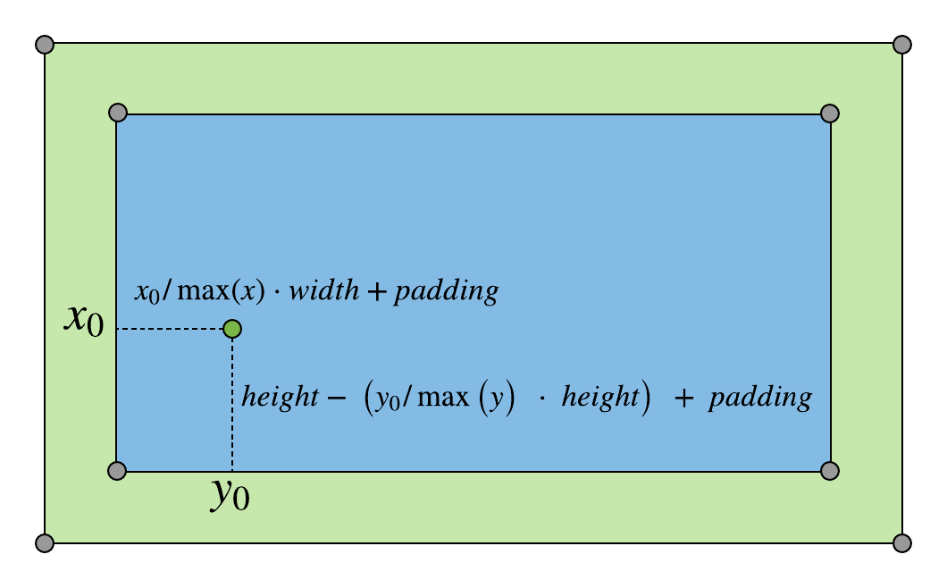
Plotting points and connecting them with lines
With the chart area set up, we'll want to start plotting points and connecting them with a line. I added a point to my diagram with expressions of how to calculate the XY coordinates for any element from the dataset. The expressions use the element's X and Y values and the container's height, width, and padding.
With these expressions we can map the data to coordinates for an SVG polyline:
const data = [
  { label: 'S', x: 0, y: 0 },
  { label: 'M', x: 1, y: 4 },
  { label: 'T', x: 2, y: 3 },
  { label: 'W', x: 3, y: 1 },
  { label: 'TH', x: 4, y: 4 },
  { label: 'F', x: 5, y: 5 },
  { label: 'S', x: 6, y: 4 }
];

/*
	data.map(e => e.x) returns an array of only the x values:
			[0, 1, 2, 3, 4, 5, 6]
	then we spread this array in the Math.max function so the
		values in the array can be used as arguments for the function

	we repeat these steps for the y values in data
*/
const maximumXFromData = Math.max(...data.map(e => e.x));
const maximumYFromData = Math.max(...data.map(e => e.y));

const points = data
    .map(element => {
			/*
				map over each element in the data array and
				calculate the x and y values for the SVG point
			*/
      const x = (element.x / maximumXFromData) * chartWidth + padding;
      const y =
        chartHeight - (element.y / maximumYFromData) * chartHeight + padding;
      return `${x},${y}`;
    })
    .join(' ');
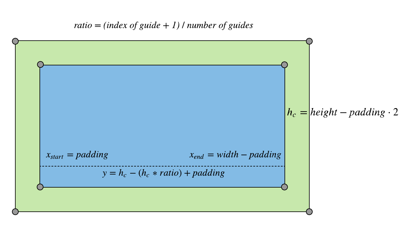
Making the chart easier to read with guides
To make our chart easier to read, we will add guides.
I started by adding horizontal axis guides to my diagrams. To lay out a guide, it needs a calculated ratio of the index of the guide plus one to the number of desired guides:
> ratio = (index of guide + 1) / number of desired guides
The ratio is then used in calculating the y coordinate of the horizontal line:

The x coordinate for the start of the horizontal guides is the padding value. The x coordinate for the end of the horizontal guides is the width of the canvas minus padding.
const HorizontalGuides = () => {
    const startX = padding;
    const endX = width - padding;

		/*
			Array(n) creates an array of n length and
			fill(0) fills the created array with zeros
			so we can map over it
		*/
    return new Array(numberOfHorizontalGuides).fill(0).map((_, index) => {
      const ratio = (index + 1) / numberOfHorizontalGuides;

      const yCoordinate = chartHeight - chartHeight * ratio + padding;

      return (
        <>
          <polyline
            fill="none"
            stroke={'#ccc'}
            strokeWidth=".5"
            points={`${startX},${yCoordinate} ${endX},${yCoordinate}`}
          />
        </>
      );
    });
  };
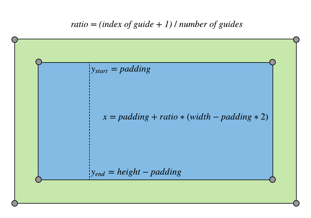
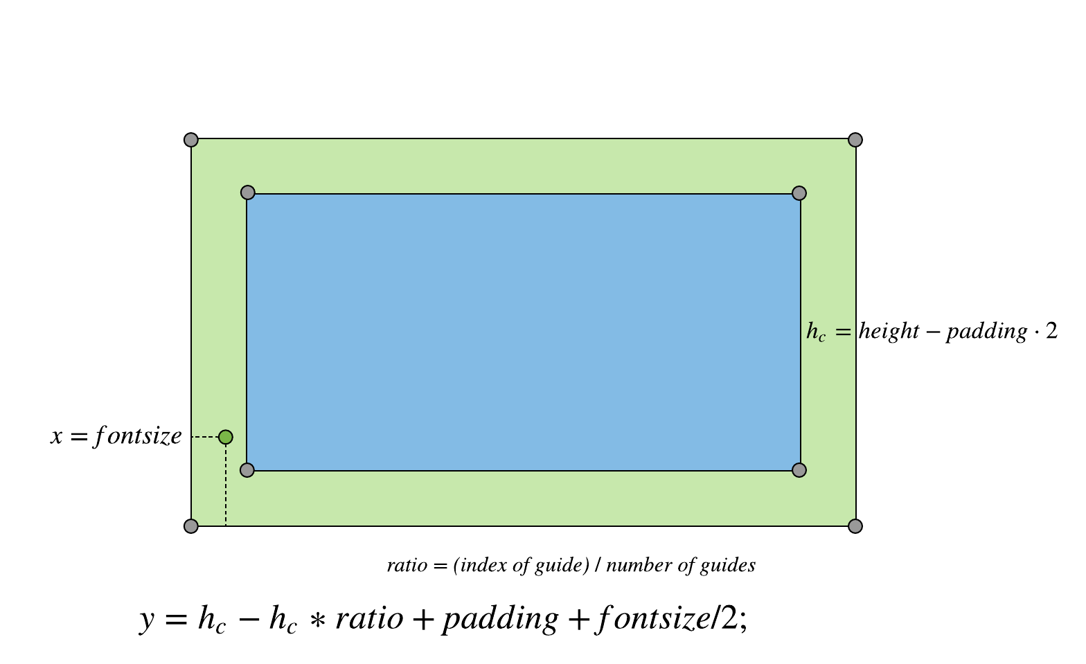
I added vertical guides to my chart, using the same ratio calculation used in laying out the horizontal guides.
In the vertical guides, the ratio is used to calculate the x coordinate for the guides:

The y coordinate for the start of the vertical lines is equal to the padding. The y coordinate for the end of the guides is equal to the height minus padding.
Note:
For the vertical guides, the number of guides is set to the number of data points minus one if the number of desired vertical guides is not passed in to the LineChart component as a prop.
const VerticalGuides = () => {
	/* if numberOfVerticalGuides is null, use the length of the data
		 to calculate the number of guides */
  const guideCount = numberOfVerticalGuides || data.length - 1;

  const startY = padding;
  const endY = height - padding;

  return new Array(guideCount).fill(0).map((_, index) => {
    const ratio = (index + 1) / guideCount;

    const xCoordinate = padding + ratio * (width - padding * 2);

    return (
      <>
        <polyline
          fill="none"
          stroke="#ccc"
          strokeWidth=".5"
          points={`${xCoordinate},${startY} ${xCoordinate},${endY}`}
        />
      </>
    );
  });
};
Adding labels to the guides
To make our guides more useful we can add labels along the axes.
I added x-axis labels to the diagram. The x coordinate for the data element's label is calculated by multiplying the ratio of the element's x value to the maximum x value from the dataset by the width of the chart and adding half of the padding value. The y value is calculated by subtracting the padding value from the height value and adding half of the font size value.
const LabelsXAxis = () => {
    const y = height - padding + FONT_SIZE * 2;

    return data.map(element => {
      const x =
        (element.x / maximumXFromData) * chartWidth + padding - FONT_SIZE / 2;
      return (
        <text
          x={x}
          y={y}
          style={{ fill: '#ccc', fontSize: FONT_SIZE, fontFamily: 'Helvetica' }}
        >
          {element.label}
        </text>
      );
    });
  };
Y-axis labels
Next I added y-axis labels to the diagram. There are as many labels as there are horizontal guides. The x coordinate is equal to the font size variable. To calculate the y coordinate, I calculated the ratio of the index of the label by the number of guides. I multiplied this ratio by the chart height and subtracted the resulting product from the chart height. I then added padding and the font size divided by 2.
const LabelsYAxis = () => {
    const PARTS = numberOfHorizontalGuides;
    return new Array(PARTS + 1).fill(0).map((_, index) => {
      const x = FONT_SIZE;
      const ratio = index / numberOfHorizontalGuides;

      const yCoordinate =
        chartHeight - chartHeight * ratio + padding + FONT_SIZE / 2;
      return (
        <text
          x={x}
          y={yCoordinate}
          style={{ fill: '#ccc', fontSize: FONT_SIZE, fontFamily: 'Helvetica' }}
        >
          {parseFloat(maximumYFromData * (index / PARTS)).toFixed(precision)}
        </text>
      );
    });
  };
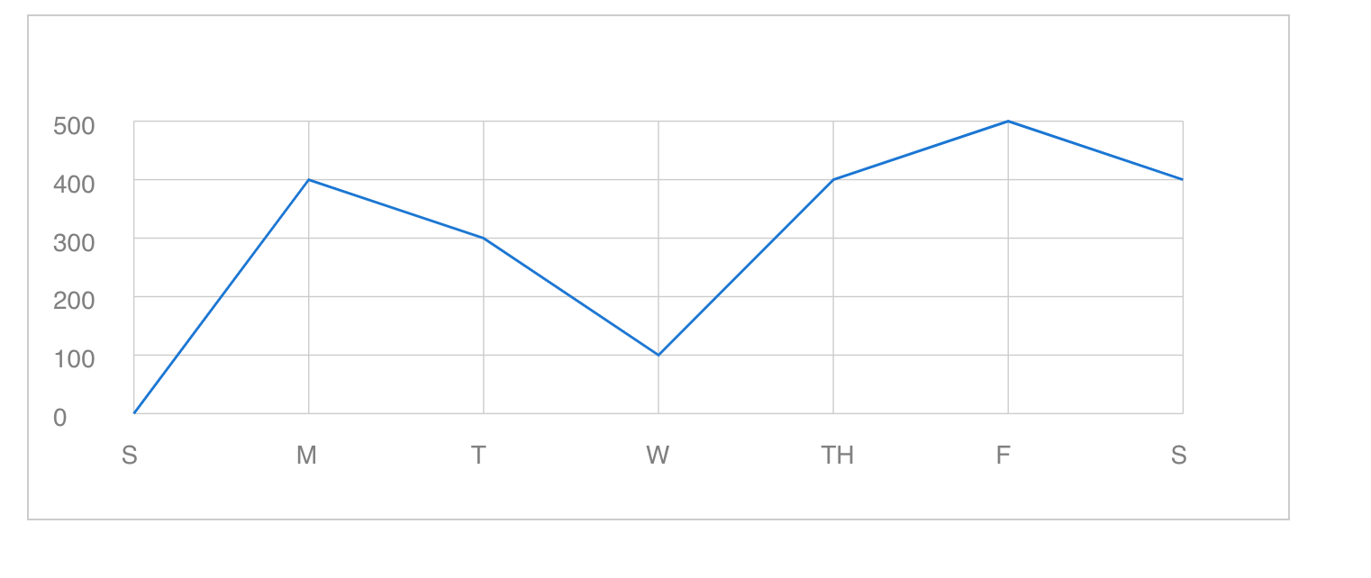
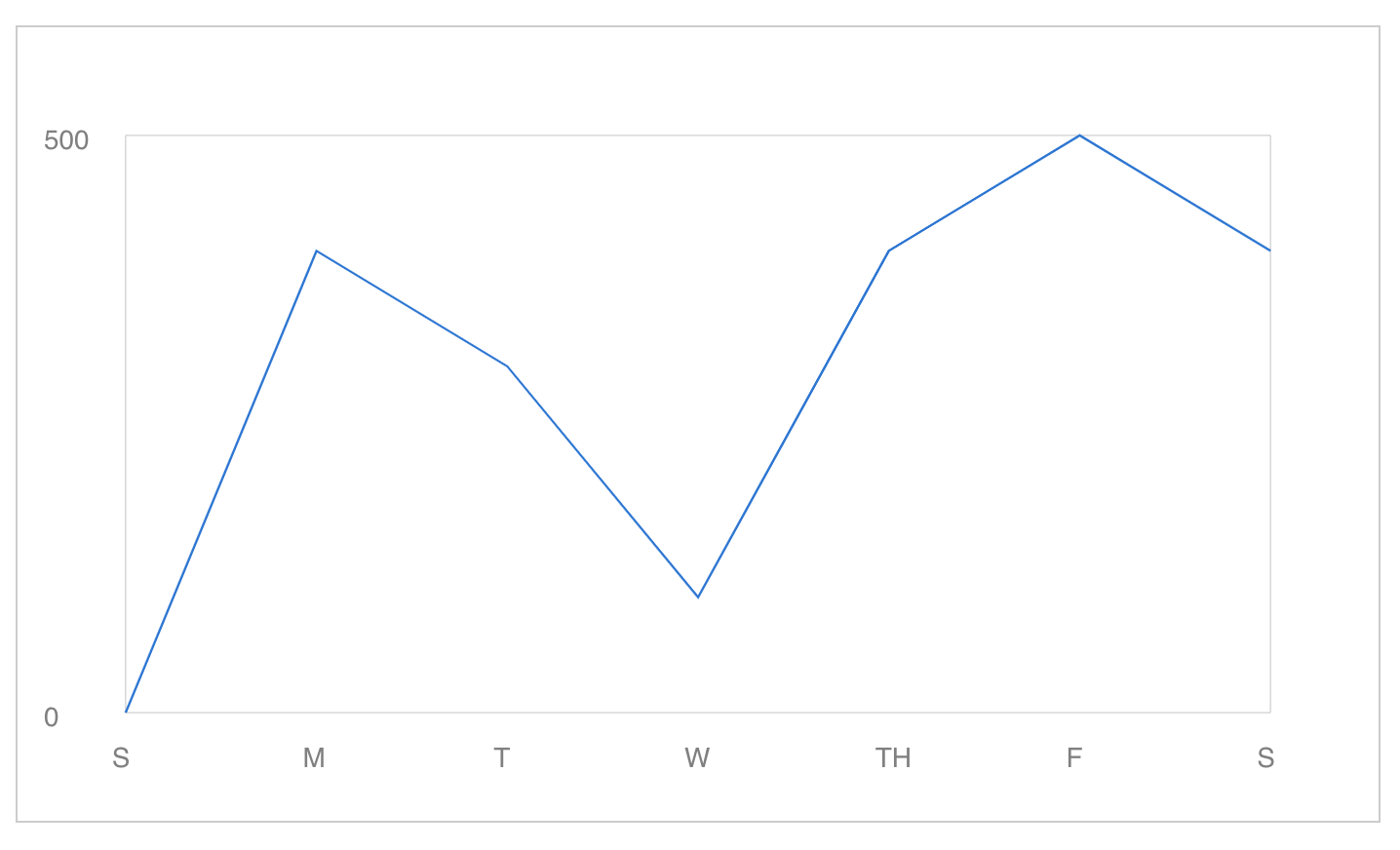
Finished SVG line chart example
The result is our finished chart!
import React from "react";
import LineChart from "./components/LineChart";

const data = [
  { label: "S", x: 0, y: 0 },
  { label: "M", x: 1, y: 400 },
  { label: "T", x: 2, y: 300 },
  { label: "W", x: 3, y: 100 },
  { label: "TH", x: 4, y: 400 },
  { label: "F", x: 5, y: 500 },
  { label: "S", x: 6, y: 400 }
];

function App() {
  return (
    <div style={{ padding: 25, maxWidth: 700 }}>
      <LineChart
        data={data}
        horizontalGuides={5}
        precision={0}
        verticalGuides={6}
      />
    </div>
  );
}

export default App;
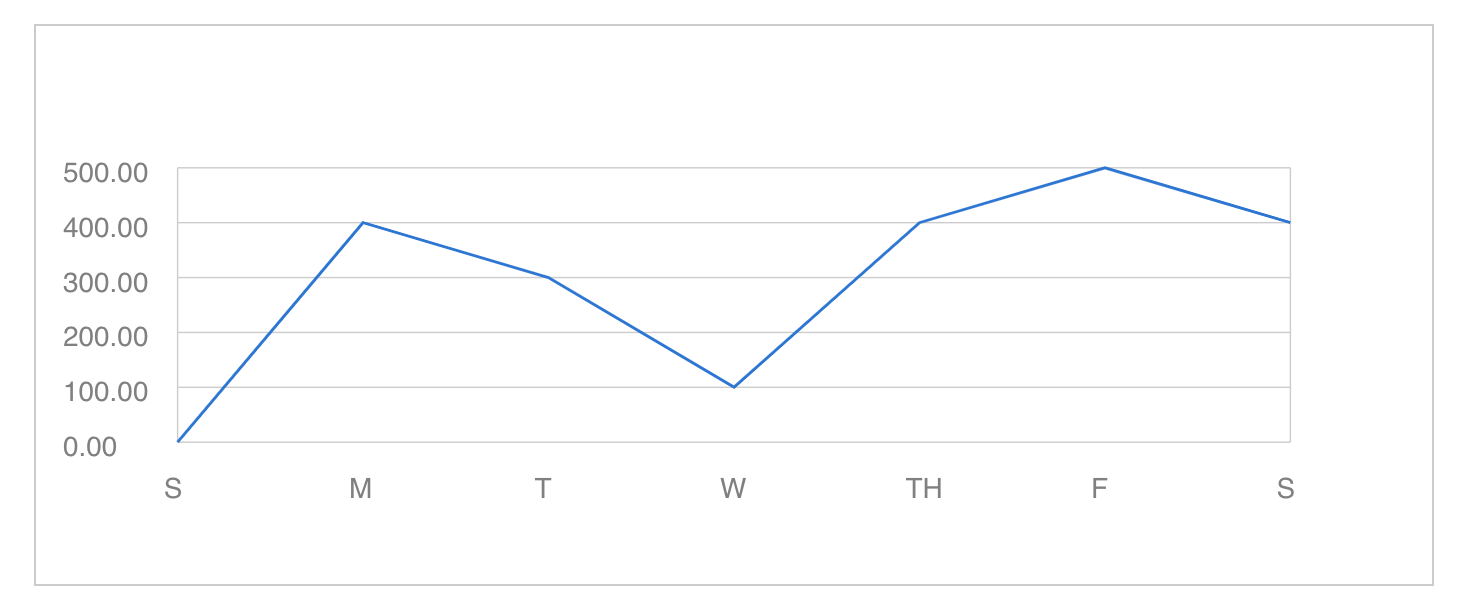
Experimenting with properties
Try experimenting with the height, width, and guides properties. And in reviewing the source code, you'll see I've added a prop for setting the precision of the y-axis label.
Change Example 01
/* Modified height, vertical guides, and precision of y-axis labels*/
<LineChart
  height={200}
  data={data}
  horizontalGuides={5}
  precision={2}
  verticalGuides={1}
/>
Change Example 02
/* Modified height, width, and guides props */
<LineChart
  height={350}
  width={600}
  data={data}
  horizontalGuides={1}
  precision={0}
  verticalGuides={1}
/>
Adding Y-axis unit labels and titles
You might remember from math class that a chart needs unit labels on the y-axis and a title. Add these as sibling components or modify the chart component to accept these as props as well.
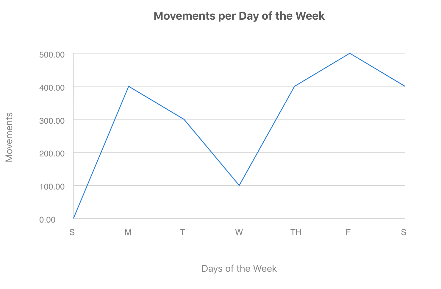
function App() {
  return (
    <div style={styles.chartComponentsContainer}>
      <div/>
      <ChartTitle text="Movements per Day of the Week"/>
      <Label text="Movements" rotate/>
      <div style={styles.chartWrapper}>
        <LineChart
	        width={500 }
          height={300}
          data={data}
          horizontalGuides={5}
          precision={2}
          verticalGuides={1}
        />
      </div>
      <div/>
      <Label text="Days of the Week"/>
    </div>
  );
}
Happy coding!
Source code
You can find the source code for the project here.
Resources to learn more about SVGs
Once you are familiar with the foundational components of SVG, you can pair that knowledge with CSS styles and animations and powerful tools like Figma to create engaging visualizations.
SVG: Scalable Vector Graphics | MDN
The MDN topic for SVG includes links to documentation, tutorials, and examples including mapping, interactions, animations, and games. It's a great resource to work through in order to learn SVG.
Styling And Animating SVGs With CSS
In her article for Smashing Magazine, Sara Soueidan covers in detail what SVGs are, editing and optimizing SVGs in graphics editors, styling SVGs, and animating them. The last section on making responsive SVGs is especially worth reading.
Want to join our development team?
We're always looking for talented and open-minded people to help us bring new ideas to life. See what it's like to work at Headway and the opportunities we currently have available.