
The importance of iconography
If you're wondering how to design icons for your app, you're in the right place. We'll be covering the best ways to create custom app icons no matter what design tool you use.
Icons are a crucial part of our day to day lives. Look around and you’ll see just as much text instructing you as you do iconography. It’s such an important part of our world that even films build out believable icon systems. Check out Typeset In The Future: The Alien Edition.
In application design icons can help communicate complicated features with limited space and transcend communication barriers that would require additional localization.
What you will learn
This guide is constructed to help designers build out their own icon set that can help them deliver on their vision. It’s filled with useful tips, best practices, and guides on how we do things here at Headway.
Before you start
What icons do you need for success?
When it comes to designing icons, figuring out which icons you’ll need at the start of the project can be difficult and intimidating. However building up a system for your icon will allow you to continually add on to your set. Listing out common interactions like profile or settings and starting to build out this list will help you to start sketch out what icons you think you’ll need.
Do you create or find an icon set?
Creating a full icon set will help you build uniformity across your application, if you don’t want to create one from scratch there are tools out there to help you find complete icon packs. Noun Project and Iconfinder are some great resources if you’re looking for a full pack. If you’re not looking to create a set below are still some excellent points to keep an eye our for in a pack.
Get your free icon kit set here 🤙🏼
Sketching ideas and kit-bashing
When starting to layout your set it’s good to start sketching out some icon ideas on paper. If you’re trying to test out a few ideas this is quick and easy. A grid or dot grid note book will help a ton.
When you’re looking for inspiration feel free to look at places like Dribbble, Iconfinder, and Noun Project to see what others are doing. These resources are invaluable so use them. When it comes to Noun Project or Icon Finder, if you have a subscription you can also grab icons to place in your set as place holders until you’ve finished your set. Kit bashing like this will help you start to think about your system as a whole.
Resources for icon design inspiration
Icon styles
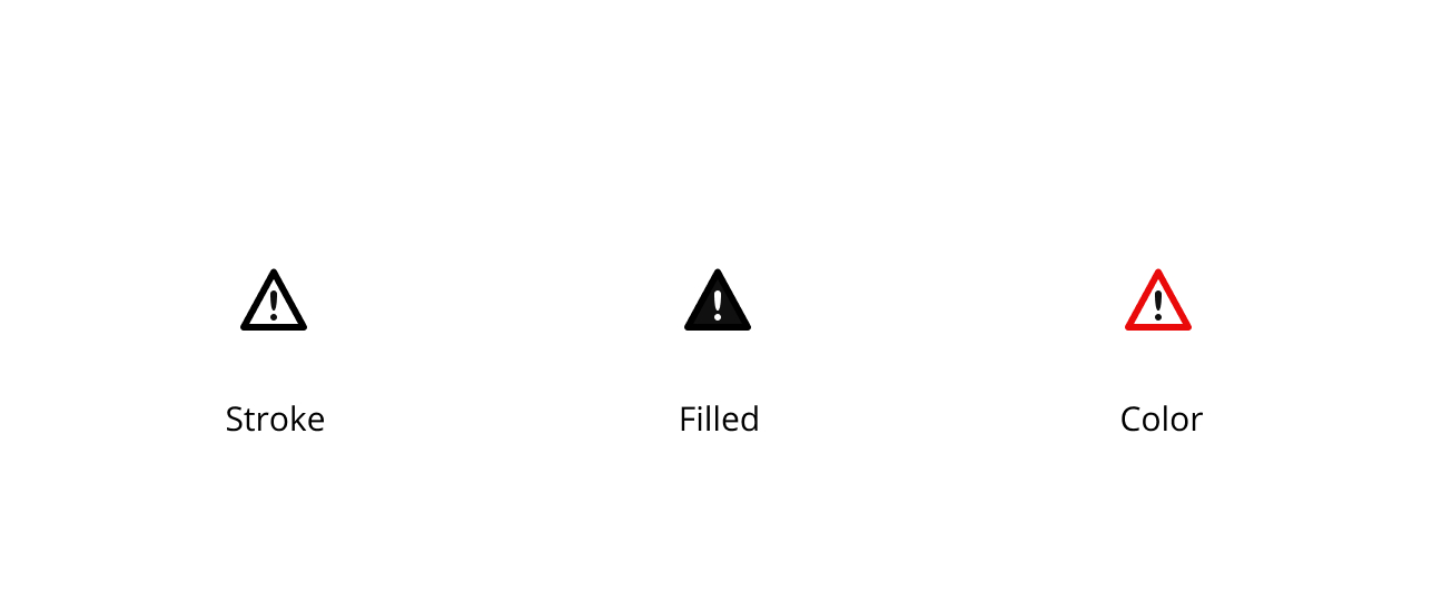
There are a few stylistic choices you can make when you’re building out your icon set. Do you go with a stroked icon style, a filled glyph style, do you add color? Maybe you go with flat design versus skeuomorphism.
Let’s cover three design elements that have an impact on icon style.
Stroke
Stroke icons can give you room to add more detail than a filled set. They can be mixed with a filled set to create either active states or compliment some icons that just don’t work well with a filled state.
Filled
Filled icons can give more clarity and importance to an icon or interaction. Their traditionally bolder and have a higher tendency to catch a users eye just like a bold font would.
Color
When creating your set you can do some interesting things with color, is your entire set a single color, do you add color on a hover state or does each icon have 2 colors if they’re apart of an important feature.
Icon design guidelines
The anatomy of a good icon and icon system
A good icon system is consistent not only with the each other but with the over all design of their final placement.
Depending on the platform you’re building for icons are constructed in a multitude of different ways. Each mobile OS has their own guideline put together for how they construct icons for their system. Below we’ve laid out some general things to consider when creating your icon.
Material Design Icon Principles
Icon size
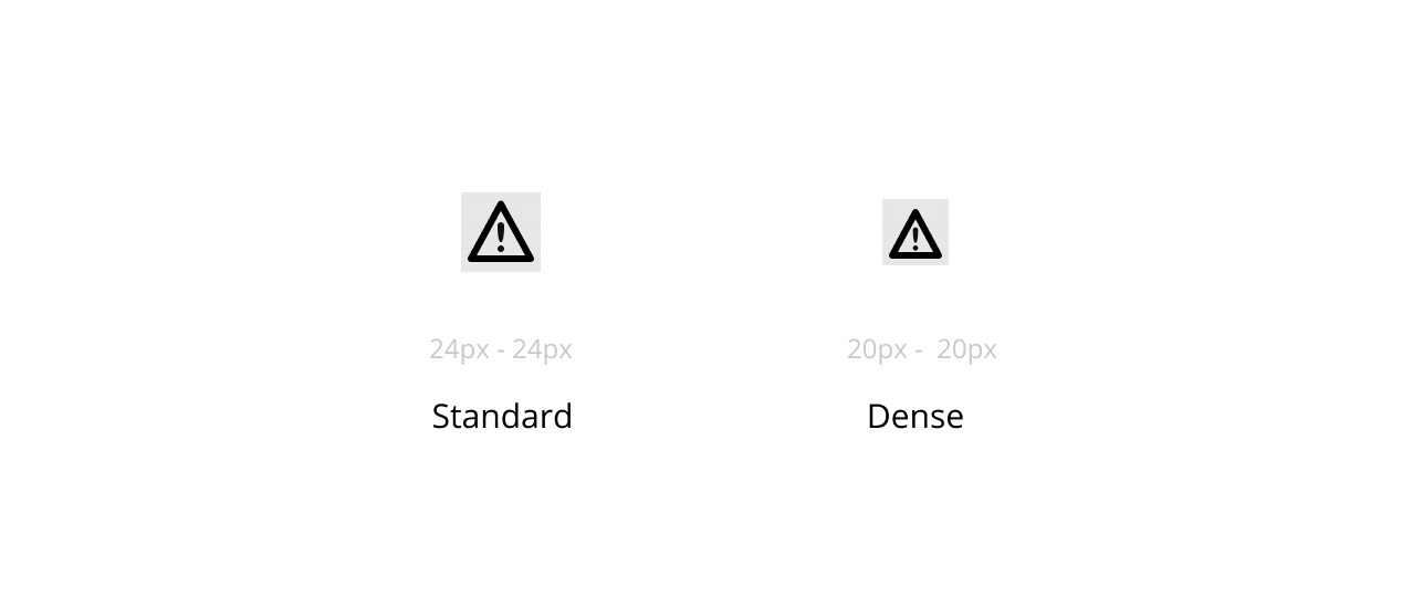
Icons should follow some basic size guidelines when being created. Consider the device these icons will be on and the method of interaction (mouse or touch or in most cases both). Sticking to a 24x24 pixel icon is a great middle of the road icon size to start out with. If you want something smaller a 20x20 pixel icon is good as well and works really well for dense displays where a mouse will be the primary interaction method.
Icon grids
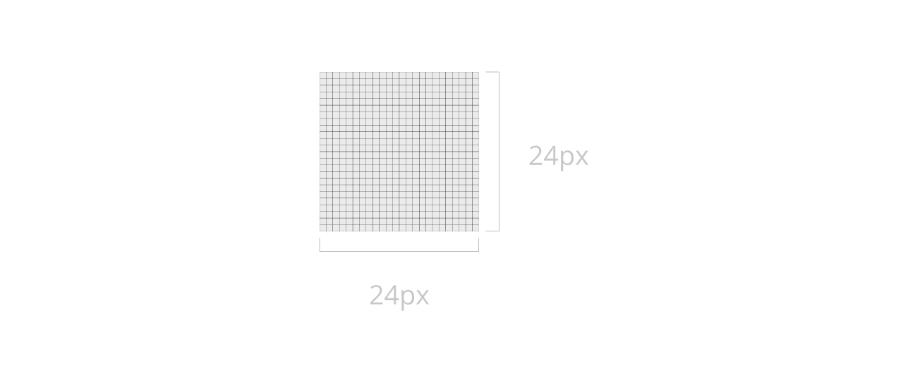
The icon grid, regardless of how you’re building it should be a 1px grid. Starting with a 24x24 pixel square will help you design icons regardless of platform. Most design tools will allow you to export assets @2x so you can easily achieve the 48x48 pixel minimum set by Apple. If you need smaller icons on a platform like web you can also try to make dense icons and set up your grid to be 20x20 pixels.
Content area
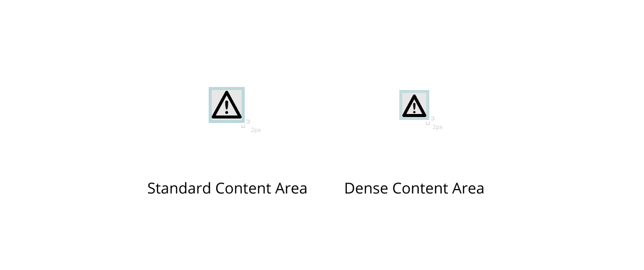
Within your base grid keeping a 2px perimeter keeps icons from feeling cramped. For example your content on a 24px icon should not exceed the 20px content area. Similarly on a smaller/dense icon they should not exceed the 18px content area. This will also make a smaller target size, but create a larger hit box and help with some basic selectable accuracy.
Padding
With in your icon this 2px perimeter acts as padding built right into the icon it’s self.
Placement & touch areas
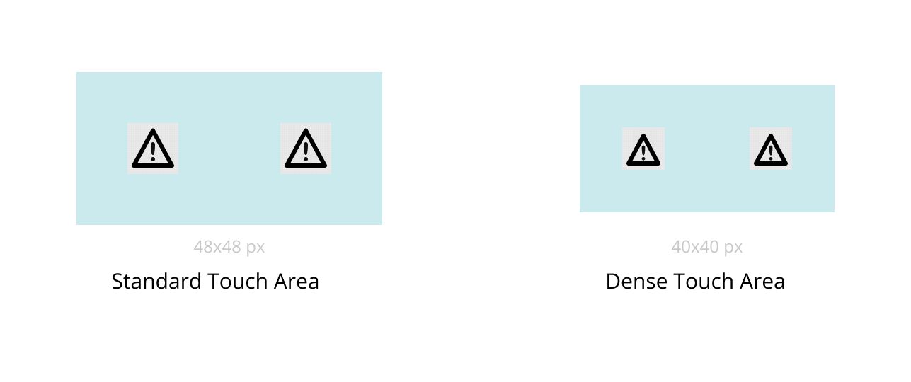
When placing icons into your design there are a few things to consider. The icon its self will be too small of a touch area on mobile devices. So leaving a touch areas that is roughly 2x the size of the icon around it will help tremendously.
For example if you have a 24px icon the touch areas should be 48px. If you have a 20px icon the touch area should be 40px. This touch area can be baked directly into your icons when creating an icon system for easy placement or can be part of your UI kit in your icon component.
Best practices for icon design
Here are some best practices we’ve defined as a team at Headway.
Stroke
- Stroke Width - Always keep a consistent weight on the stroke, normally we’ll select a 1px or 2px stroke.
- Stroke Placement - Keeping stroke centered will keep your design consistent between closed vector shapes or open ones.
- Pixel Guides - When you’ve got your pixel guide on, making sure to keep your stroke on the center of a pixel will help you avoid blurry lines on the smallest PNG sizes. Since it’s not trying to drawn between 2 pixels.
- Spacing - between elements should try to be a similar widths around. Sticking to a 2px gap will keep a good amount for the negative space and keep visibility.
- Caps - Most tools will allow you to select what type of caps you’d like. You can round off the ends, or keep them square. Depending on the style you’re going for each one will work just remember when adding a cap you’ll be adding about a pixel worth of fill to the end of each vector.
- Corners - Each tool will allow you to change the way the corners work. You can keep them default which will product hard 90 degree angles, there are also rounded and angled.
Filled
- Spacing - When it comes to filled icons the biggest thing to keep a look out for is the use of negative space. Keeping a 2px gap in most spots will help create nice negative space.
- Offset Tricks - Things like offset line tricks like this can help keep your negative space to a single side and you won’t have to worry about using up too much space. (slash through eye graphic)
Color
- Single Color - It’s best to keep a single color for your icons. If you need to have different states making a second set with the modifications will be your best path forward. Since mobile still uses PNG files you’ll have to export all states of your icons.
- Multi Color - Using multicolor icons can help create hierarchy amongst your icons, for example adding some color to the arrow in a send icon can draw attention to this icon when it’s amongst a set of icons.
Size and scaling
- Stroke Vs Vector - when it comes to scaling your icons down in size or increasing their size there are two things to think about. If you want a uniform stroke at all times regardless of size you can keep your lines set to the stroke value in your tool of choice. If you don’t want uniform weights you can collapse down your shapes to a vector object or use a .svg. Then the weight of the line will scale accordingly with the size of the shape.
Exporting
PNG
PNGs are still used in most mobile development environments so here are items that we want to keep in mind.
- Transparency - we need to make sure to keep the backgrounds transparent so we can easily place these objects
- Color - if our icons are changing colors for states we’ll need to make sure we’re exporting each variation of that icon.
- Size - When exporting PNGs mobile will need a few sizes.
- iOS will require 3 total sizes.
- 24x24 @1x
- 48x48 @2x
- 72x72 @3x
- Android will require a total of 5 sizes.
- 48 × 48 (mdpi)
- 72 × 72 (hdpi)
- 96 × 96 (xhdpi)
- 144 × 144 (xxhdpi)
- 192 × 192 (xxxhdpi)
SVG
When working on web we are able to use SVGs, which are vector files. We do not need to export multiples of them since they can programmatically be changed and altered and will always keep sharp clear lines.
SVG Prep Checklist that can help you get your icons ready for export.
Naming Conventions for Icons
Our standard naming convention follows this basic format:
ico - name of glyph - modifier @scaling factor .file format
Example: ico-search-dark@2x.svg
Why We Follow This Naming Convention
When sorting icons in your directories we want to make sure their easily findable, when assets tend to all get grouped into a single directory a good naming convention can make is easier for the team to find.
- Ico - tells the team that this is an icon file
- Name of Glyph - a descriptive name of what the icon is
- Modifier - How might this icon differ from a base version
- This is very important on mobile since we’re still using .PNG files on mobile at the moment.
- Scaling Factor - Your tools should automatically add this to the end of the file when you set up multiple exports. This will allow devices to pick the right icon size they need and will export your icons at this scaling factor. For example a @2x version of a 24px icon will export out at 48x48 pixels
- File Format - Your tool will also add this to the file name as well when you select what type of icon you’re exporting. Just remember .PNG is a rasterized image file and .SVG is vector based.
Working in Figma - icon creation and management
Using frames
Keeping your object in a frame at all times allows you to easily add this object to a library file or turn it into a component. Frames will also allow you to add a general clipping mask and place a grid over the top. When prepping icons for export make sure your frame has the background turned off.
Grids
When setting up a grid it’s best to set up a 1px grid and save it as part of your library so you can quickly drop it into your frame file when creating an icon. You can create multiple grids if you wanted to see half lines as well.
Vector network
Figma uses a vector network so adding vector points or deleting them is as easy as ever. Here is their entire blog post on it. Introducing Vector Networks by Figma
Collapsing your shape
If you’re making a complicated icon shape and you’re using masks and multiple vector shapes you can collapse down your shape by pressing CMD + E.
Stroke
Settings are controlled here there is inside, outside, and center and weight. You can also adjust the way caps and corners work here.
We hope this icon guide and pack is a helpful tool to designers and non designers. We’ll be adding to this series on the technical side of design so make sure to subscribe to our newsletter so you can stay up to date with our latest design guides and resources and get our free icon pack!
Free Icon Pack - Download
Need a quick way to get started on your next project? Download our free icon pack so you can start making progress and learn how to design your own icon set in Figma on top our starter pack.
👉 Get your Free Icon Pack 🤙🏼
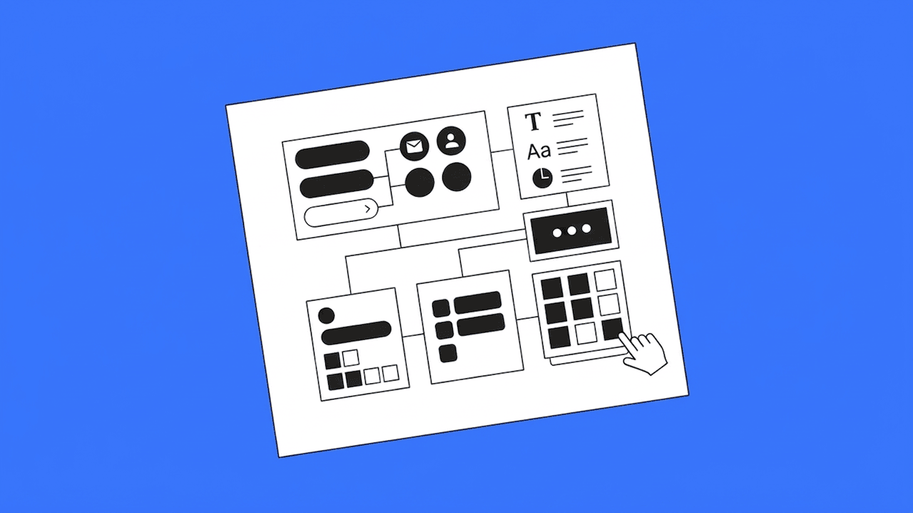
Next steps - from icons to UI kits
Now that you have a good grasp of creating and managing icons, you can look into jumpstarting your projects with UI kits as well. I covered best practices for using Figma UI kits to create your own custom design system in this video below.
You can also grab our free Figma UI kit to help you build your own design system.