

During a product's lifecycle, it may evolve to encompass a broad set of features and user personas/roles. As designers on a product, we want to make sure we have built out a scalable design system, UI kit, and documentation. These are necessities for the success of the design team while the product grows. Future designers on the product will thank you.
But what if the product needs to support multiple mini products, that need to share similar themes & patterns? Do these mini products need to have things that are unique to themselves?
That situation is a perfect opportunity for Multi-Tiered UI Kits!
Headway's case for Multi-Tiered UI Kits
During a product life cycle, teams eventually create smaller or adjacent products to the core product being designed. Those situations are the perfect time to expand out a design system and UI kit.
We were already using atomic design for the entire system and also had a suitable organization method across the board. The issues included design files getting too large, running out of memory, and having too many assets to navigate through in a single file.
We knew from the start of the project that these additional products were a potential for us, so we did some leg work at the beginning to set up a smoother transition. The opportunity was identified by the design team during the initial client onboarding and vision discussions. These new products would need to share a majority of the patterns and UI/UX we had already developed, but also have unique design patterns for that specific product.
What is a Multi-Tiered UI Kit?
A Multi-Tiered UI Kit is when you take what normally would be in a single UI kit and break it up so it lives in multiple files/libraries. For example, managing your icons in a different file than your UI components or bringing in a data visualization library that inherits colors from a brand library. We'll expand on how we do this through out the rest of this blog post.
When are Multi-Tiered UI Kits helpful?
- When you have an extensive product, and you're looking for a way to compartmentalize features - or your product has smaller products with-in it that might share similar patterns.
- When you have a feature that belong in multiple products, having this as its own library will help keep things up to date.
- When you want to have some design system governance to help keep things consistent at a higher level.
Establish a foundation and iterate
We'll establish some general guidelines and tips when setting up a Multi-Tiered UI Kit and explain how we set up some of Headway's in-house UI kits. None of these are perfect solutions, and we're always evolving our process and methodologies. But we want to share what our design team has learned at Headway, and we hope you'll share some of your best practices with us.
Setting up a Multi-Tiered UI Kit
Now that we've identified that we need to set up a Multi-Tiered UI Kit, how do we make it happen? Since most design tools allow the use of shared design libraries, that will be the core feature we'll build in the UI kit along with the atomic design principles.
In Headway's case, we already had some of this taken care of from the initial set up - so from here on out, we'll be working through what a new set up will look like.
The setup plan:
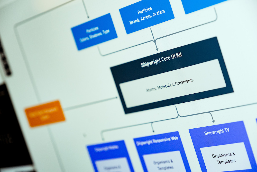
Level 0 Kits
• Core Design Kit
• Brand Design Kit
• Data Visualization Kit
Level 01 Kits
• Product 01 Kit
• Product 02 Kit (more as needed)
Level 02 Kits
• Marketing Kit
Begin at Level 0
We'll start by making our highest level UI kits first. These kits will house elements that will be shared in just about every design file we end up creating. Using reusable components and atomic design, we'll build out a scaleable system for any size project.
We call these the Level 0 Kits.
Level 0 Kits
Core Design Kit
The Core Design Kit will house our lowest level components. This kit includes things like color palettes, type styles, button components, and even navigation and modal templates. It will be the foundational building block of our system.
We'll build up the components (with atoms being the smallest), such as our plate backgrounds and labels. Then we will use molecules for our buttons and states. Last, we'll use organisms for universal product UX/UI patterns.
We refrain from having templates in the core design kit; most of our templates will be driven by the individual product kits. One exception template that could be in the core design kit is one that would have both embedded navigation and a content replacement area for the page's content.
Brand Design Kit
The Brand Kit is an optional kit that will dictate brand-specific color palettes of iconography and images. This kit might collapse into the core kit on smaller projects. On larger projects, there may be space for a brand kit - especially if you're working on a platform that will contain multiple assets and brands.
Data Kit
The Data Kit is an optional kit containing a reusable set of data visualizations to be placed across your project. It will help keep things constant across the board. This is helpful when working with larger data-heavy products.
The Data Kit will have the Core Kit "turned on" within it as a design library - so we don't have to define new colors or typestyles.

Level 01 Kits
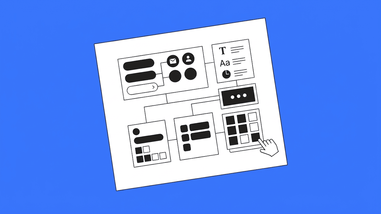
Product Kit
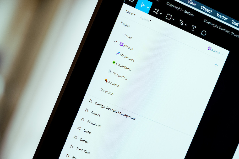
The Product Kit is the specific product you're working on. In here, we'll store product-specific patterns, components, and templates. These kits may still have an Atoms page for specific components. Molecules and organisms will also be present, and pretty robust. Instead of framing our groups by a component of function, we will frame the items by feature or template page name.
And rather than having a single template page, we'll create a new page for each type of template. We found that some features were nuanced, resulting in multiple templates being created or customized core level templates being nested into the templates.
Level 02 Kits and beyond
We haven't used many level 2 kits. However, what could live here is a marketing kit. The kit would include templates that could be used to create assets for showcase sites like Dribbble and Behance, or even social sites like Instagram and Facebook.
Design files
The final step is the design files. Now that we've set up our kits, what do we put in the design files? We've already done so much work in the UI kits, so the design files are reserved for placement and prototypes. Here you'll be pulling in from your one product kit and making the changes accordingly. Using templates and replacing components, we will define different designs and prototypes.
If a project is larger we tend to first set up our design files as a per-feature file, followed by the pages in the different sub-flows. Keep in mind that not every design file would have to be set up that way - especially on smaller projects.
Keeping files organized and processes updated
Since a lot of our UI kit is distributed amongst many files, there is extra responsibility on us to keep things extra tidy and organized. Here are a few things we've implemented to accomplish this:
Indexing file names
This naming convention is a bit of a carry-over from when we were still prototyping in Invision. Using double-digit values and sorting by name helps drive the sequencing of files. It also allows them to index your project view in a very clean fashion. Here are some example names:
- 00.00 - UI Kit Core
- 00.01 - UI Kit Data Viz
- 01.00 - UI Kit Product 1
- 02.00 - Product 1 Home Page
- 02.01 - Product 2 User Management
Always allow for indexing files in the same order. Just think of it as -
[ Level ].[ Order ] - [ Clear and User Friendly Name ]
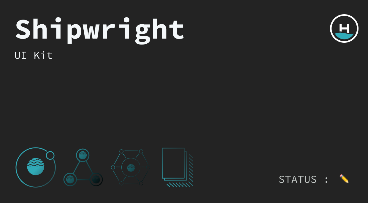
Covers
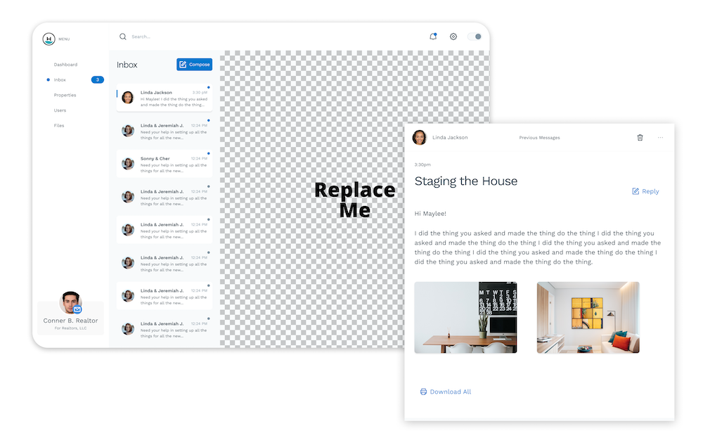
Using the first page of a file to act as a cover page will help keep things easily visible when looking through potentially dozens of design files. Setting up a frame at 620 x 320 and adjusting the background color of the page will allow you to use text or emojis to communicate what the file is.
Here is an example of our internal one:
Frames
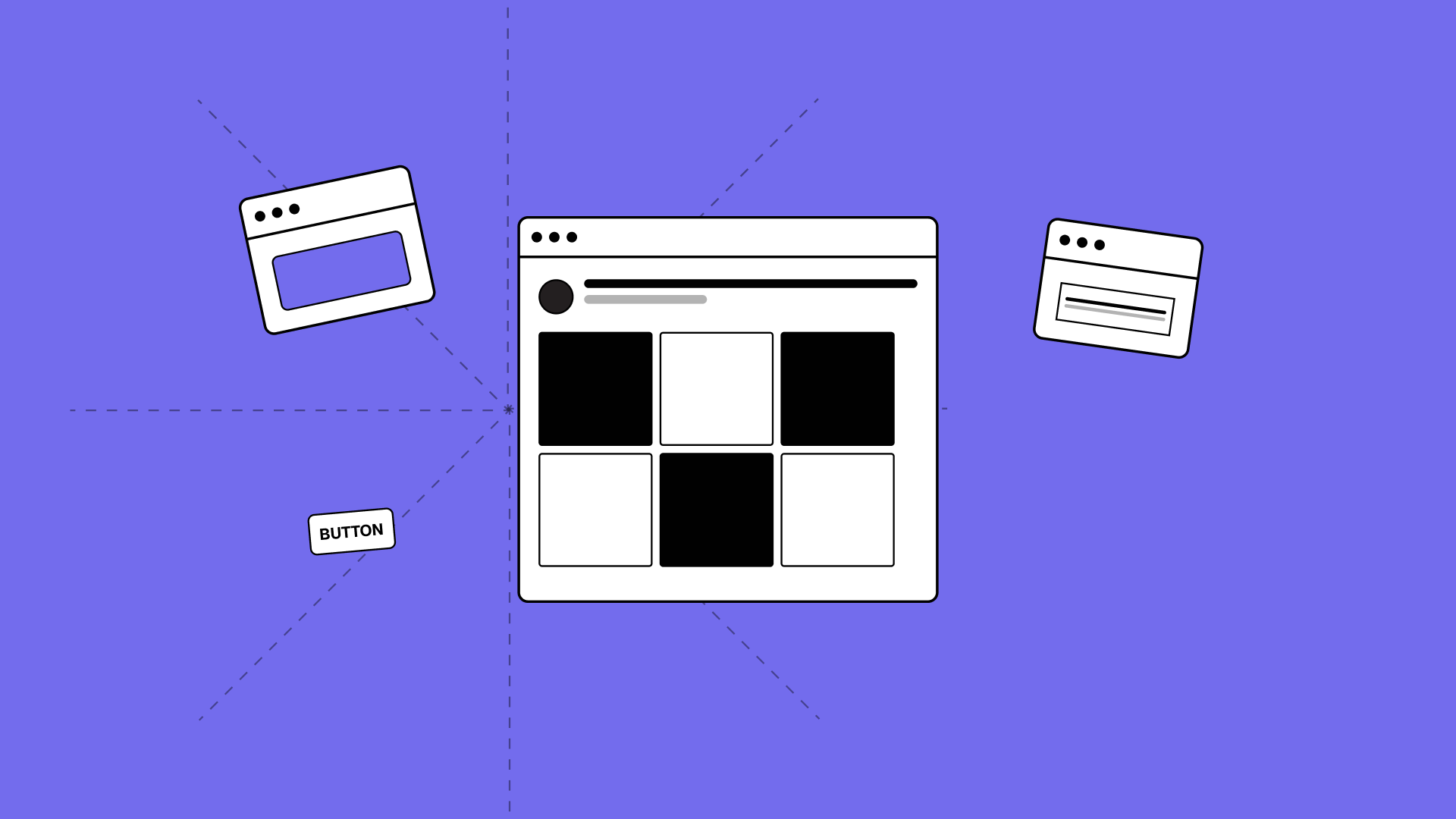
When setting up our collections of components, we'll often drop similar things into a frame. This will act as a folder for these assets and help reduce the name of the component.
For example, instead of button/primary/active, we can first have a frame called button then start with primary. This will act the same way when searching for assets in the component library.
Component descriptions
Using the built-in description area will help inform the rest of the team and even remind us where a component lives, or how it's being used. This is a great way to communicate information to everyone using the UI Kit.
Pushing components up
A constant question is, when does a component from a product UI Kit get pushed up to a Core UI Kit - and when is the right time to do that. Our general rule of thumb is if it needs to be in multiple products or sub-products, it should be in core. As you get started, you'll find out what works best for your team as you work on your Multi-Tiered UI Kit.
Tips and tricks
Page content components
Set up your file to replace the page content. This will tremendously reduce the number of components you have floating around. It can easily be done by having a page template that has a designated component that can be replaced. Creating page content components will decrease the file sizes and layout stress since you'll only have the 1 page template.
Default blank component
Make a component called default blank with nothing inside of it (instead of using the EYE to change the visibility of an object). Doing this will save on memory, since hiding it with the eye will not.
Final thoughts
Converting our first large scale project to a Multi-Tiered UI Kit has been an exhilarating and daunting task. We're continuing to learn and adapt our process and will hopefully share more as we continue on this expedition. Below are some links we've found useful to us during this journey.
Design systems references and resources
Intro to Design Tokens in Figma
Design Systems Architecture Diagrams
7 Steps to Building Your Own Design System From Scratch
Design System Updates and Communication
Getting Started with Design Systems
Figma design system management and documentation
Want to join our design team?
We're always looking for talented and open-minded people to help us bring new ideas to life. See what it's like to work at Headway and the opportunities we currently have available.
Learn more about careers at Headway