

As a front-end developer, it’s common to experience problems when working with a designer and the files they share.
Let's talk about what those are, why they happen, and why atomic design can help.
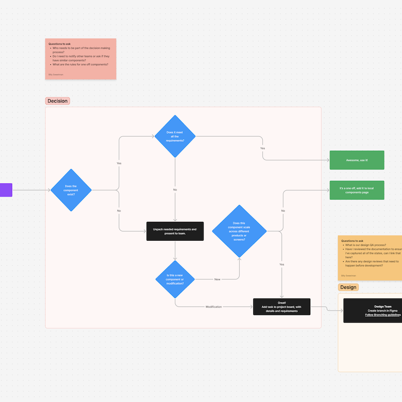
Common design hand-off problems
- Too many one-off designs that take time away from clearing backlog issues
- Too much time is spent maintaining one-off designs
- Devs brought into the conversation after design and stakeholders have approved a design
- Stakeholders don’t understand the time and trade-offs involved with creating one-off components from scratch
These complaints are common because communication is hard! Especially between different teams who may only have a vague/cursory understanding of how the other teams operate.
How can we take positive steps to solve this communication problem and create cohesion between the different teams?
Let’s talk about the ways you can prevent them from happening.
Adopt a design system based on the atomic design methodology
Why atomic design?
If you haven’t heard of "atomic design" - it is a methodology for designing and building user interfaces in a systematic and structured way.
The methodology was created by Brad Frost and is based on the idea that complex user interfaces can be broken down into smaller, more manageable parts or building blocks.
Atomic design uses 5 levels
Atoms

Atoms are the smallest building blocks representing UI elements like buttons, inputs, and labels.
Molecules

Molecules are groups of atoms that work together to form more complex UI elements like forms, search bars, and product cards.
Organisms

Organisms are groups of molecules and atoms that make up entire UI components, such as headers, footers, and navigation bars.
Templates
Templates are a higher level of abstraction that defines the layout and structure of a page or interface.
Pages
Pages represent specific instances of templates with real content and data.
The atomic system creates consistency
The key idea behind atomic design is that these building blocks can be combined and reused in various combinations to create consistent and scalable user interfaces. Using atomic design, designers and developers can create a more efficient and cohesive design process by building reusable components that can be used across multiple projects.
This leads to
- Faster development times
- Easier maintenance
- A more consistent user experience
Creating alignment with design hand-offs
There are many benefits to adopting an atomic design system, such as ensuring consistency, flexibility, reusability, scalability, and maintainability of your project.
However, I want to focus on how this system can improve your team's efficiency.
Adopting an atomic design system will go a long way in creating a shared understanding and common operating picture between development and design.
With both teams aware of what components are available and capable of, you can greatly reduce the chance of surprise designs or, at the very least, help correctly forecast when more work may be needed for one-off designs/builds.
Evaluate your current process
Before implementing a system, evaluate your tooling.
Questions to ask your team
- How are designs generated and shared with the dev team?
- Is there a central location for all designs, or are there individual files for each design?
- How does the design team know what the coded components are actually capable of?
- How is the dev team communicating available components back to the design team?
Your tooling can go a long way in creating a shared understanding of your design system. Modern tools can really help your team be disciplined in sticking to a design system.
Free template to gather this data

We put together a design system interview template that has all the questions you need to help organize and gather this data from everyone on your product team.
Setting best practices with two sources of truth
While it may seem counterintuitive, you need two sources of truth to define your design system.
Design team sets expectations
The design team maintains one source of truth representing the expectations for a component. This source defines what a component should look like and be capable of.
Development team manages execution
The dev team will maintain the second source of truth, representing the execution of a component - what it looks like and is capable of. Most teams are very comfortable delivering designs to a dev team but often fall short of communicating the execution of components back to the design team.
Design system tools to accomplish this
Figma - manage expectations
The design team maintains a Figma file as the expectation for your project.

Figma can be easily configured to enforce theming, such as color names and values, typography values, spacing values, etc. It can also be configured to use instances of components across the design - so if changes are made to the base component, those changes will be represented across the entire design system.
This is also a great place for devs and designers to comment on and discuss the behavior of the designs.
Storybook - manage execution
The development team maintains a storybook instance as the execution of the project.

Storybook is an open-source tool for building UI components and pages in isolation. It's a development environment that allows you to create, test, and showcase your components in an isolated environment without needing a full application setup.
Storybook can easily be configured to display multiple variants of a component and all the attributes that affect a component's performance. You can also provide documentation on how the component is supposed to behave.
Share these tools with each other
Occasionally, execution diverges from expectations. When this happens, it is vital to address any disparities. Reliance on a governance model will help you navigate these waters, but your organization may not be ready yet. At a minimum, a prompt huddle after completing a component can aid in "leveling the bubbles."
A designer can quickly identify areas in which changes are required in the coded component.
At the same time, adjustments to the design may be necessary if certain elements are not feasible due to technical or time constraints. This huddle is instrumental in aligning expectations with execution.
Free template to create your own governance model

Our Design System Governance Template is great for this.
By fostering a shared understanding of the project's current capabilities among Dev and Design, you can increase productivity, reduce frustration, and expedite the creation of new features.
You've got this
Implementing a new atomic design system may seem daunting and overwhelming, but it is a decision that can yield significant benefits.
You can successfully navigate this transition by fostering constructive team dialogue, taking a measured approach, and maintaining discipline in using your tools. With time and practice, this new process will become second nature, and you'll find it hard to imagine how you previously managed without it.
Learn how we maintain design sytems that teams actually use.
Design system resources
We have some resources to assist you in jump-starting this process:
Design Systems in Figma Course
Shipwright - Free Figma UI Kit and Design System
Getting Started with Design Systems - Free Video Series
Design System Governance Template