

Once your design system is in production or used by a larger team, new items will need to be added. Components and elements will get created, and we need a strategy to promotes those assets to the core system or one of the sub UI kit files.
We will go through the step-by-step process we like to use at Headway to keep our design systems up to date.
Design system management helps prevent problems caused by design debt.
For this example, we'll assume we're using a federated team model where there isn't a single owner, but the team owns it.
What we will cover
- Setting up your design system project board
- Nominating and depreciating assets
- Establishing a design system standup meeting
- Collaborating with your development team
I also did a presentation on our design system management process that covers everything in this article. You can watch the video below.
Setting up your design system project board
Before your system goes live, it's good to create your design system project board. This can be set up using a kanban board with Trello, Asana, or even Notion. We need a board set up that will allow the team to catalog new components that they would like to nominate for promoting up or depreciating.
Columns in our design system boards
On this board, we set up our columns in a similar fashion to the build process but add a few more columns.
- To-Do
- Design
- Approval / Documentation
- Depreciating
- Removed
- Complete
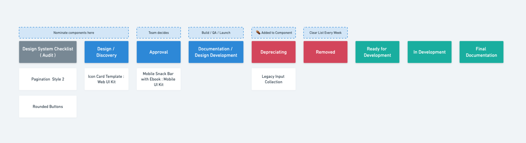
You don't have to follow this board setup but it's generally what works the best for the product teams at Headway.
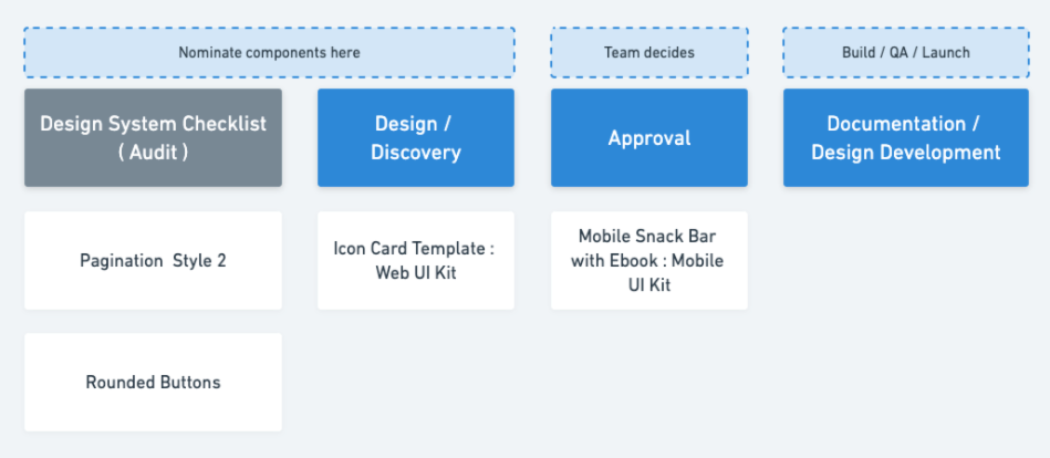
To-do
The to-do list might be a carryover from when your project was first started. This might be what's left from your design system checklist and can house components that are still outstanding, and the team would like to get in the system.
Design
This column is used for components the team would like to add to the system or one of the underlying UI kits in the multi-tiered UI kit.
When a designer is working on a project and creates something they need/want to componentize, they can add a card with a link to the Figma frame and where they think it should go. Then the team can discuss in the standup if they believe it should go in or not.
Depending on your structure or permissions, this might be a column to tell the team what is being added. And then the discussion isn't needed.
Approval / Documentation
This column is for components that are set up and completed. Once the team agrees on what should get the go-ahead from the design column or to-do columns and the works is complete they would get moved here.
Components in this column have had the following things checked off:
- Follows established naming conventions
- It is using tokens/shared styles and sub-components
- Constraints are set up correctly
- Auto layout is set up if applicable
- All states are set up if applicable
- It is placed in the correct spot in the design system and is labeled correctly using the management system
- It is rolled out to a project and is in active use, if applicable
Once this checklist is done, make sure the component is linked to or has written documentation.
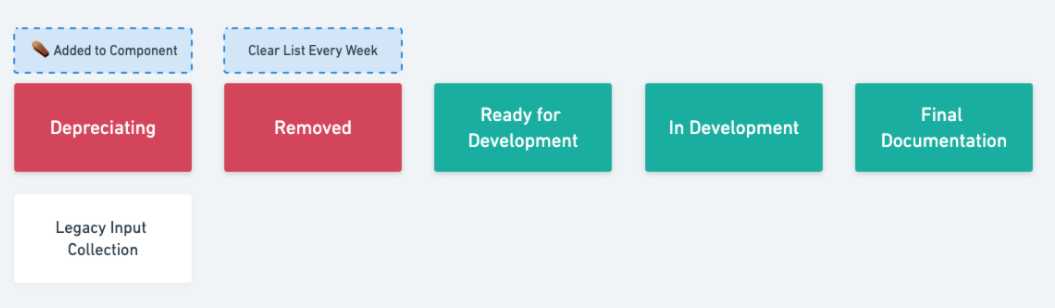
Depreciating
There are components or styles that the design team is ready to remove from the system. Once an item is identified here, a member from the design team should append a ⚰️ to the name, so the team knows it will be removed.
This is the time to discuss if there will be a replacement component or not. Once an item is marked for depreciating, it is best to give it until the next design system stand up before it's been entirely removed.
Removed
Items that have been entirely removed out of the system go here before they are dragged into complete. This is just a spot to let the team know that it's gone, and they will not find it in the system anymore.
Complete and ready for development
All tasks, when completed and reviewed as a team, will end up here.
Design team standup
Once your system goes live, it's good to establish a recurring design system standup meeting. This can be either once or twice per week.
The standup meeting allows the design team to share new components being creating and discuss items they'd like to nominate to be added to the system. They can also suggest changes they'd like to see to the current system.

When working in the federated team model, it's ideal to have the entire team discuss what's being added and removed. Using the board set up above to facilitate the conversation will help keep the design team updated with the latest design system changes.
This is a great time to connect with the development team to see where the live design system might be. Your board might get a bit more complicated when working with the development team, so you might want to think about adding a few new columns. Some of the ones we suggest are in development and design QA.
Development
This column is here to communicate to the development team that this component is ready to be developed in the live system. Once complete, the developer and the designer should re-connect on the documentation side of things.
Design QA
Once a component is in the live system, it's always good to have the design team do a final QA pass on the component before moving it to complete.
Design system management tools
Create a central hub for designers, engineers, product and marketing teams. Connect everyone working with your design system.
A design system manager plugin for Figma. Define or update design tokens in one single panel, right from Figma and immediately see the changes cascading through your Figma design.
Set up a design system channel on your team's slack for asynchronous communication, short discussions, and quick feedback.
Notion is an excellent place for documentation and creating a design system project board to manage updates.
Become a design system pro with our new video course
We just released our premium design system course for Figma.
It covers everything from planning, laying foundations, design tokens, developer handoffs, and more.
Everything you need to help lead your team.
20+ videos and new Figma templates to make the design system process way easier.
Free design system resources
Managing Your Design System in Figma
Learn how we manage component status and other assets within our Figma design systems to create clear communication across our design teams.
Multi-Tiered UI Kits for Design Systems
During a product life cycle, teams eventually create smaller or adjacent products to the core product being designed. Those situations are the perfect time to expand out a design system and UI kit.
Design Tokens in Figma Design Systems
Learn how to set up your Figma file and some tools that can help facilitate the tokenization of your design system in Figma.
An introduction to creating design systems, including some of the tools and best practices we've picked up along the way for successful design system planning.
Figma Plugins for Better App Design Workflows
Discover our favorite Figma plugins we use in 2021 to help us improve our app design workflows, communication, and build better products.
UX UI Audit - Find Design Debt and Create Actionable Plans for Improvements
Learn how you can leverage the design audit process for your product or website.
Atomic Design Systems for Front-End Developers
Learn how the atomic design approach can improve design handoffs and make front-end development less chaotic.
The Design System Stakeholder Guide: Translating Progress into Business Value
Struggling to explain your design system’s impact? Discover tools and rituals to align your team’s work with what leadership cares about.


