If you're running a design system, you already know that the components are only half the story. The other part that actually determines whether your system thrives or collects dust isn’t always the most fun, but it's the most important. Skip it long enough, and the gap between your system and your live products becomes a design debt problem of its own.
Let's talk about the rhythms and rituals that act as the support infrastructure around design systems. These are not only the meetings, documents, and patterns you facilitate as a team, but also how you organize your team. This is for design system leaders who might be thinking of how to demonstrate value to stakeholders continuously.
Underneath all of it is a simple truth: a system is only as good as the team's ability to run it day to day. If that's the capability you're building, our guide to building a design team that ships production-ready work is the companion piece to this one.
Considerations:
Think of all of these items as tools in a tool belt, not everything here is going make sense for every team. We’re just looking to show some activities, assets, and frameworks that have worked for us in the past.
Another variable to consider is, whether you are just launching your system or if it is a bit more mature. Depending on if you’re in full onboarding mode or maintenance and growth, your communication patterns might change. These two different stages need two different support structures. So make sure to keep that in mind.
Assets and documentation
Documentation in general is going to have varying levels of impact depending on your team’s size, structure, maturity of your system, and overall needs. However, even the smallest teams usually report to someone, and having things organized well is always helpful.
Design stand up meeting notes and recorded sessions
On a larger team, your design leads or leadership might not be in every single meeting. So we want to make sure they can catch up easily.
We started cataloging our DSU AI summary notes and linking them in an easy to find area, and it's been incredibly valuable. Designers coming back from vacation can get caught up fast. Leadership can pull from them for sprint recaps.
And honestly, sometimes we backtrack into old conversations to revisit decisions we'd half-forgotten about. That’s because our DSUs aren't just status updates; they also can turn into troubleshooting and group problem-solving. Having that recorded and transcribed is worth the effort. Regardless of your systems maturity, documenting decisions and discussions is always helpful.
Documentation site
This one's sort of a given, but how you document matters. We've done documentation inside Figma, in external tools like ZeroHeight, and in platforms like Confluence and SharePoint. The tool matters less than making sure the documentation is accessible and useful.
One thing that's been a big win for us is recording how-to videos. If a component has a lot of properties and some non-obvious customization, a quick walkthrough does more than a page of written docs ever could. We’ll record ourselves using Loom and drop links in all the different places where it makes sense.
If you’re early on in your design system and have a small team, a recorded walk through of a component can work just as well as a detailed component page.
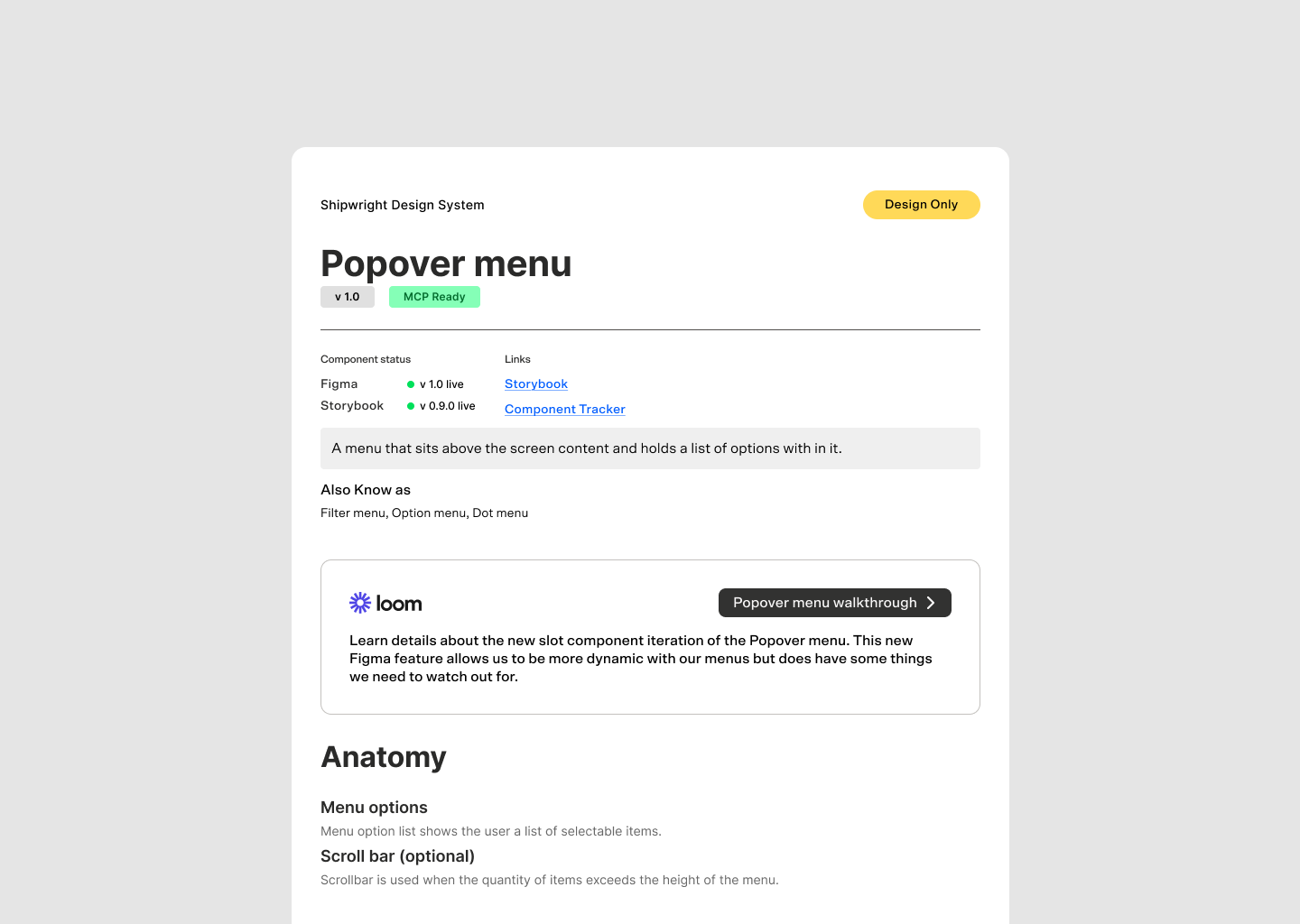
We've also leveraged recordings to offer self serve onboarding walkthroughs so new folks can self-serve their way into the system without waiting for a live session. These recordings save our teams valuable time and allow us to expand our reach to more design system customers.
When we consider what to document, we’re not trying to break down why an interface has a button, but specifically what’s different about our button.
Our documentation generally breaks down into a few layers:
- The anatomy of the component, how it is built in Figma or code.
- What are the properties, what do they map to in code, or are there custom ones in Figma?
- How to use it specifically for this product/team. What combinations are ok and when should we refrain from using it?
- How does it behave when interacted with, and what might trigger a state changes.
If you're running multiple themes, show the theme representation as well.
A bonus If there are common customized configurations, include copy-and-paste versions so people can see how versatile a component can be.
And then we point to Storybook. That's where the developer docs live, code snippets, and live component examples are available.
A central Figma project
We keep a dedicated Figma project that acts as the design system's home base. Inside it, you'll find things like our roadmap, benchmarks, and workshop which is open and accessible to everyone.
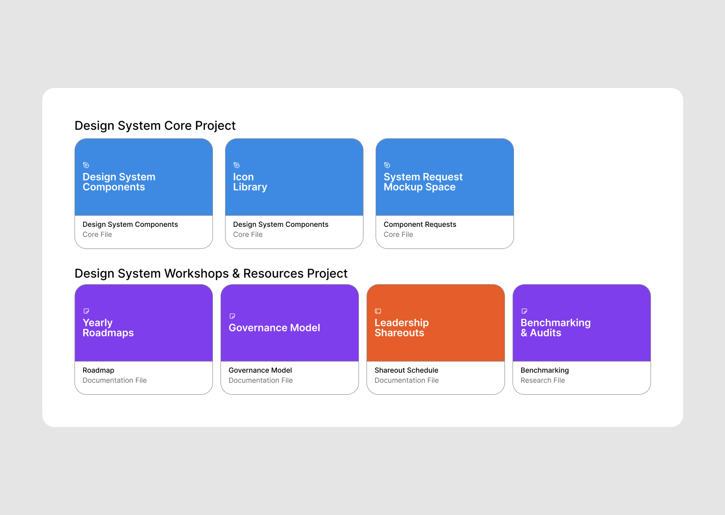
Roadmap
It lays out what we think the next year looks like. We know it's going to change every quarter when we review it, but having it visible keeps everyone informed. It covers everything from major tooling upgrades and AI enhancements down to component support and special initiatives like custom Figma plugins.
Benchmarking and Audits
That project also houses working session files where we might be auditing products or benchmarking against other design systems to identify gaps.
Governance Model
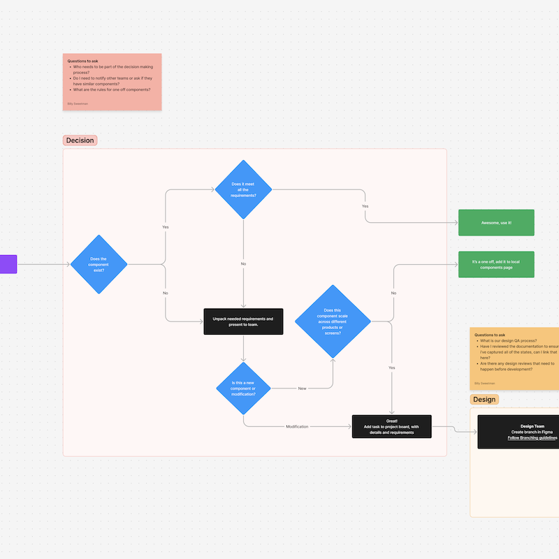
Our governance model lives there too. How contributions work, how to submit a component request, the whole process. A video walkthrough of how to submit a request through the contribution model goes a long way here.
Component request process
We've done this two different way. Sometimes it's a Figma file where designers can mock up exactly what they need, and then we have a conversation about whether they build it or we do. Other times it's a JIRA ticket, and the same goes for bugs. The goal either way is to have a clear and visible place for reporting changes and errors.
Component tracker
You can do this in Airtable, Google Sheets, whatever works. The idea is to track every component and measure how "complete" it is against a set of criteria your team came up with.
Some criteria might be:
- Design Audit
- Properties plan
- Documented properties
- Usage documentation
- Accessibility audit
- Ux copy
- etc.
Each of those can act as a checkbox, and getting them all done is 100%.
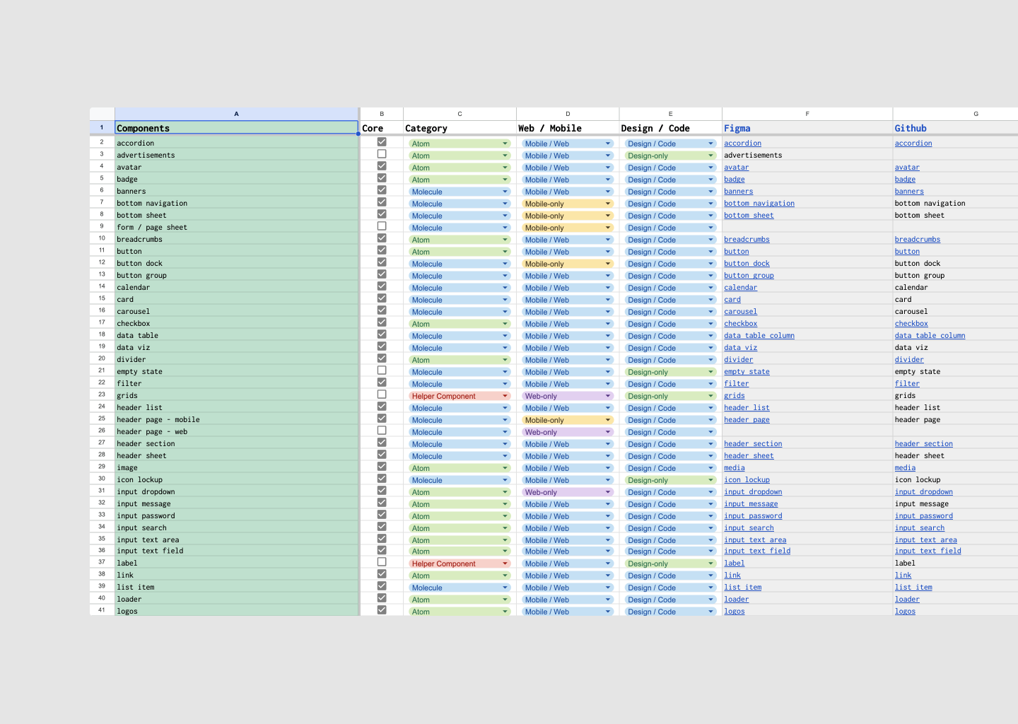
This gives you a really clear picture of not just how many components are in the system, but how many are at what level. Are they 80% complete? 100%? It's a great tool for identifying where you still have gaps.
This tracker can also help with early stage design systems to show progress, sometimes progress can be a bit slow, and leadership loves to see a metric we can track against. Having a breakdown of how complete your component library is helps them see that with the full knowledge of every detailed sprint activity.
As your system matures, this might not be as useful, because the updates are not as robust as the intial build out.
Design system MCP server
This is newer territory, but as teams dive deeper into AI tooling, you want to make sure that when developers or designers are using AI for UI generation, they're getting served the right components every time.
A design system MCP server can do that and more. We can even give teams access to your documentation right in their development environment so they don't have to context-switch to another site.
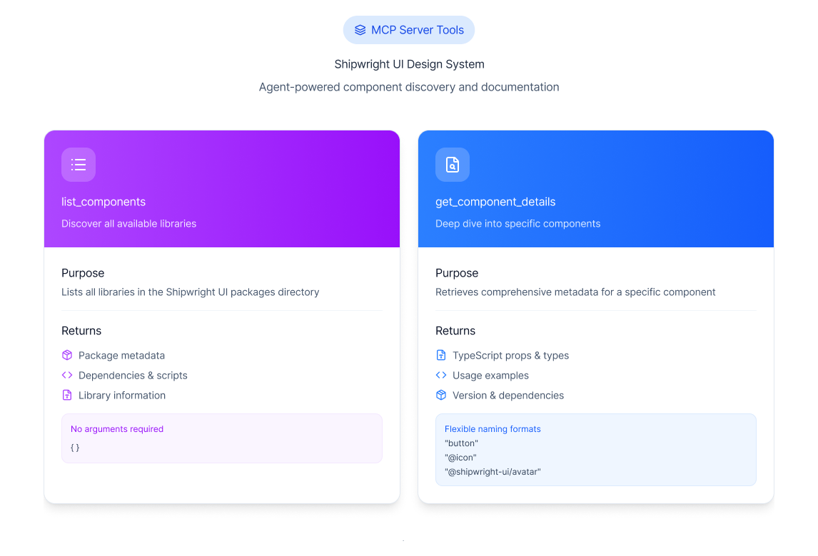
Without an MCP or some design system governance equivalent, designers and developers who are using AI models and tooling will start to create invisible drift. This drift happens because what we see looks like the design system; AI tools are great at pulling out those details. But what is missed is the actual token values, established pattern definitions, and core brand guidelines to help govern the process. For the bigger picture, see design systems for AI agents.
The goal with a well-built MCP is to always deliver your actual design system components & documentation in the correct configurations for your designs and developers.
Meetings and communication patterns
Assets and docs are one side of the coin. The other side is how you actually talk to people. Here's what's worked for us at different cadences.
Weekly: DSU and Office Hours
Stand-up happens about three times a week for the design system team. During this check in we cover what we are working on, does anyone need to collaborate, where are we in the sprint. Pretty standard.
Office hours are where it gets interesting. We break these out between design and dev, each in their own sessions. If you're running a multi-theme or multi-product design system, you might need multiple office hours for different teams.
Theme A gets their own session, Theme B gets theirs. That way each team can get their specific questions answered, and you can bridge any gaps between them.
Questions can range from just how to use a component, or trouble shooting actual technical issues and bugs. Sometimes new requests will be established during these sessions, and we can collaborate with the teams to help them contribute the changes.
Monthly: Leadership Progress Update
There are a lot of stakeholders in any organization who care about the design system and want updates. This is a monthly touchpoint where we review the last two sprints, surface any big insights, and share data from recent surveys or engagement metrics.
It's not quite a C-suite presentation, but it's close. Keep it high-level, get through the data points efficiently, and leave room for questions and discussion at the end. No need for a slideshow, just be clear and concise.
Monthly: Roadmap Review
Things change constantly. At the end of every month, take some time to align on where your roadmap stands. You could also do this at the end of a sprint if that works better for your cadence. The point is that other teams look at your roadmap to understand what's coming, and they need it to be current.
Your roadmap can live at different levels of fidelity you just need to find the right one for your team.
- In Figma, it might be more abstract and directional.
- In JIRA, it could be fully detailed tickets with planned-out steps.
We've had success both ways. The JIRA approach is nice because if someone on another team gets interested in contributing, they can just pick up a ticket and run with it. It does take more effort to maintain, though.
Quarterly: Designer and Product Team Syncs
Spend time with your designers and product teams to understand their roadmaps. Designers usually know where the product is headed, most times even before dev does, because they're often a couple of sprints ahead. Understanding what's coming helps you get ahead of those teams instead of reacting to their needs after the fact.
Quarterly: Workshops and Learning Sessions
If you're rolling out a big change like a new version of a component, a breaking change, or a new tool, it’s good to run a workshop ahead of time. Show people how it works before they have to figure it out on their own. These sessions can also just be learning opportunities: how a component works, what's changed, what to watch out for.
Quarterly or Yearly: Satisfaction Surveys
We've built our own satisfaction survey that we run every so often. Along with what we call engagement metrics, we pair those together to get a fuller picture.
Some areas we want to focus on are:
- How easy or hard is it to update to new component versions?
- What does contribution back to the system look like for individuals?
- How helpful was the documentation?
- Were there any configuration issues with components?
Here's the reality: some organizations have benchmarks they can use to measure whether the design system is making teams more productive. But a lot of places have never measured that, and it's hard to retroactively prove time saved.
So what we do instead is measure team engagement by looking at contributions to the system, documentation updates, teams showing up to office hours, and questions being asked.
We've also built tooling to scan repos and create coverage metrics, which is another powerful data point to pair with your survey results.
Yearly: Governance Model Review
You're going to create an ideal governance model, put it out there, and then things are going to change. AI is making everything move faster. Teams are contributing differently. So at least once a year, step back and ask if your governance model still working?
Is it promoting consistency, speed, and effectiveness? Or has it become a barrier that keeps people from even wanting to engage with the system?
Yearly: Onboarding Plan Review
Take a look at how you're bringing designers, developers, and product folks into the design system. What self-serve tools have you enabled? Where are people still getting stuck? Update accordingly.
Yearly: UI State Review
Go look at your live products. See how they exist in the ecosystem. Find consistency gaps, identify teams that might be struggling, and use that information to prioritize your next moves. You can also do a lighter version of this quarterly.
Communication channels
If you're on Slack or Teams, you're going to want a dedicated space for design system questions and conversations. We initially considered splitting design and dev into separate support channels, but ultimately unified them into a single channel. We wanted both disciplines to be part of the full conversation and to see all the activity around the system.
If you're managing multiple themes or brands, you might still want specific channels for those. Especially during something like a rebrand, where there's a lot of volatility early on — having a dedicated space for that team to work through the noise is helpful.
Wrapping up
Are all of these things going to work for every team out of the box? No. But that's kind of the point. Design systems are a communication game, and depending on how mature your system is, you might need to communicate differently. If you're weighing what to formalize next, moving from documented to enforceable is the jump that matters most once agents are in the workflow. It's less about the components and more about working with teams, talking to them, and understanding what everyone needs. The rituals and rhythms you establish are what turn a component library into a system that people actually want to use.
Pick what makes sense. Drop what doesn't. And keep remixing these to fit your needs.
Feeling like you want some help with your design system and team? Schedule time with us to see how we can help.